ExploreView Modes
Barchart
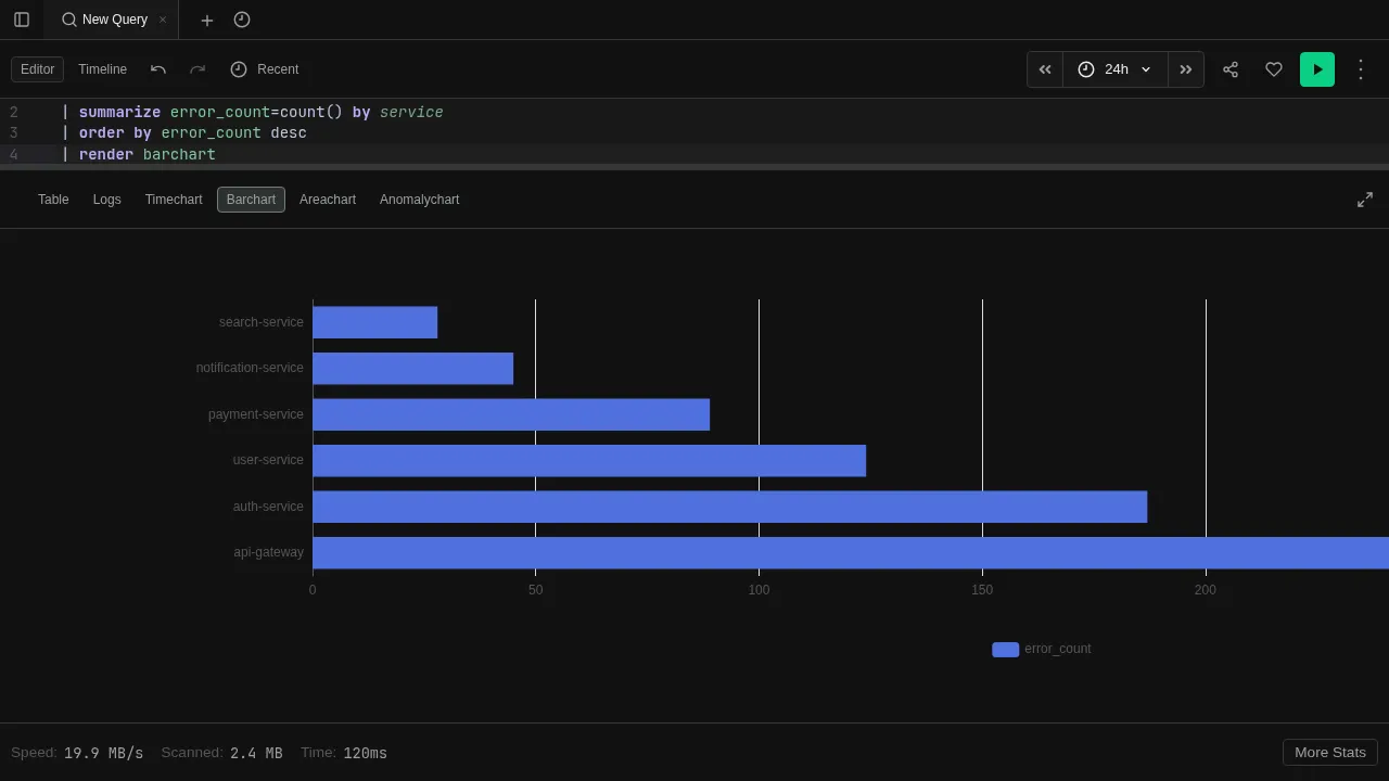
Bar chart for categorical comparisons
The Barchart view renders results as horizontal bars — one per row. Best for comparing values across categories.
Try it
datatable(service:string, error_count:long) [
  "api-gateway", 142,
  "auth-service", 87,
  "user-service", 53,
  "payment-service", 31,
  "notification-service", 12
]
| order by error_count desc
| render barchart
Features
- Categorical axis — the first string column becomes the category axis
- Multiple values — additional numeric columns render as grouped bars
- Tooltips — hover over bars to see exact values
- Auto-render — use
| render barchartto switch to this view automatically
See Visualizations for render options like title and ytitle.