ExploreView Modes
Timechart
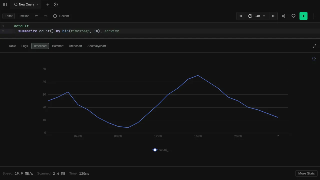
Time-series line chart for data over time
The Timechart view renders results as a line chart with time on the x-axis. Best for visualizing trends, rates, and patterns over time.
Try it
datatable(timestamp:datetime, value:long, series:string) [
  datetime(2024-01-01 00:00), 10, "cpu",
  datetime(2024-01-01 01:00), 15, "cpu",
  datetime(2024-01-01 02:00), 12, "cpu",
  datetime(2024-01-01 03:00), 18, "cpu",
  datetime(2024-01-01 00:00), 50, "memory",
  datetime(2024-01-01 01:00), 55, "memory",
  datetime(2024-01-01 02:00), 48, "memory",
  datetime(2024-01-01 03:00), 60, "memory"
]
| render timechart
Features
- Multiple series — each distinct value in the series column becomes a separate line
- Interactive legend — click legend entries to show/hide individual series
- Tooltips — hover over data points to see exact values
- Auto-render — use
| render timechartto switch to this view automatically
See Visualizations for render options like title, ytitle, and xcolumn.