Visualizations
Control how query results are rendered using the render operator
The Explore tab can display results as charts by appending the render operator to your query. This tells the UI which view mode to activate automatically.
Using render
Append | render <type> as the last operator in any query:
default
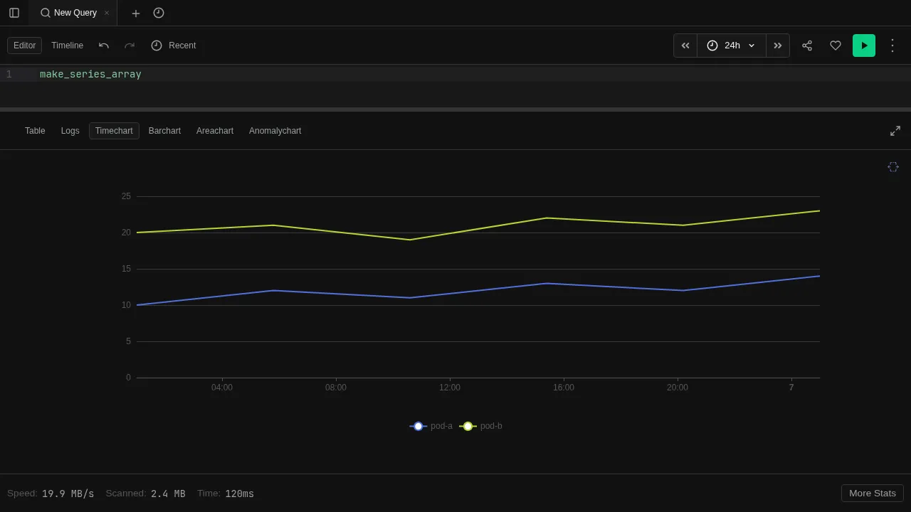
| summarize count() by bin(timestamp, 1m)
| render timechartThis produces a time-series line chart with one data point per minute. The render operator only affects display — it does not change the data.
Supported types: table, barchart, columnchart, piechart, linechart, timechart, areachart, scatterchart, anomalychart, ladderchart, card.
Render Properties
Customize chart appearance with render ... with (...):
default
| summarize count() by bin(timestamp, 5m)
| render timechart with (title="Events per 5 minutes", ytitle="Count")| Property | Description |
|---|---|
| title | Chart title |
| xtitle | X-axis label |
| ytitle | Y-axis label |
| xcolumn | Column to use for x-axis |
| ycolumns | Columns to use for y-axis |
| series | Column to split into separate series |
| legend | Show or hide the legend |
See the render operator reference for the full specification.
Manual Selection
You can also switch view modes manually from the toolbar without using render. This lets you explore the same result set in different visualizations without re-running the query. See View Modes for details on each mode.